
What Makes Ghibli Look Like Ghibli? Ghibli Aesthetic Explained
I already did the massive color research. I mapped every Holbein watercolor approved by Miyazaki and every Nicker poster paint Kazuo Oga uses. If you missed it, the full color analysis lives here. Go check it. Then come back.
Because here’s the thing: color is only the surface layer. You can have the exact Miyazaki palette on your screen, paint with Oga’s gouaches, and your work will still not look like Ghibli. So what’s actually going on?
I went deep. I read interviews, watched painting timelapses, dug through art books, and tried to break the “Ghibli feeling” into things that you, as an artist, can actually use in your own work. Here’s what I found.
1. The backgrounds are doing all the work
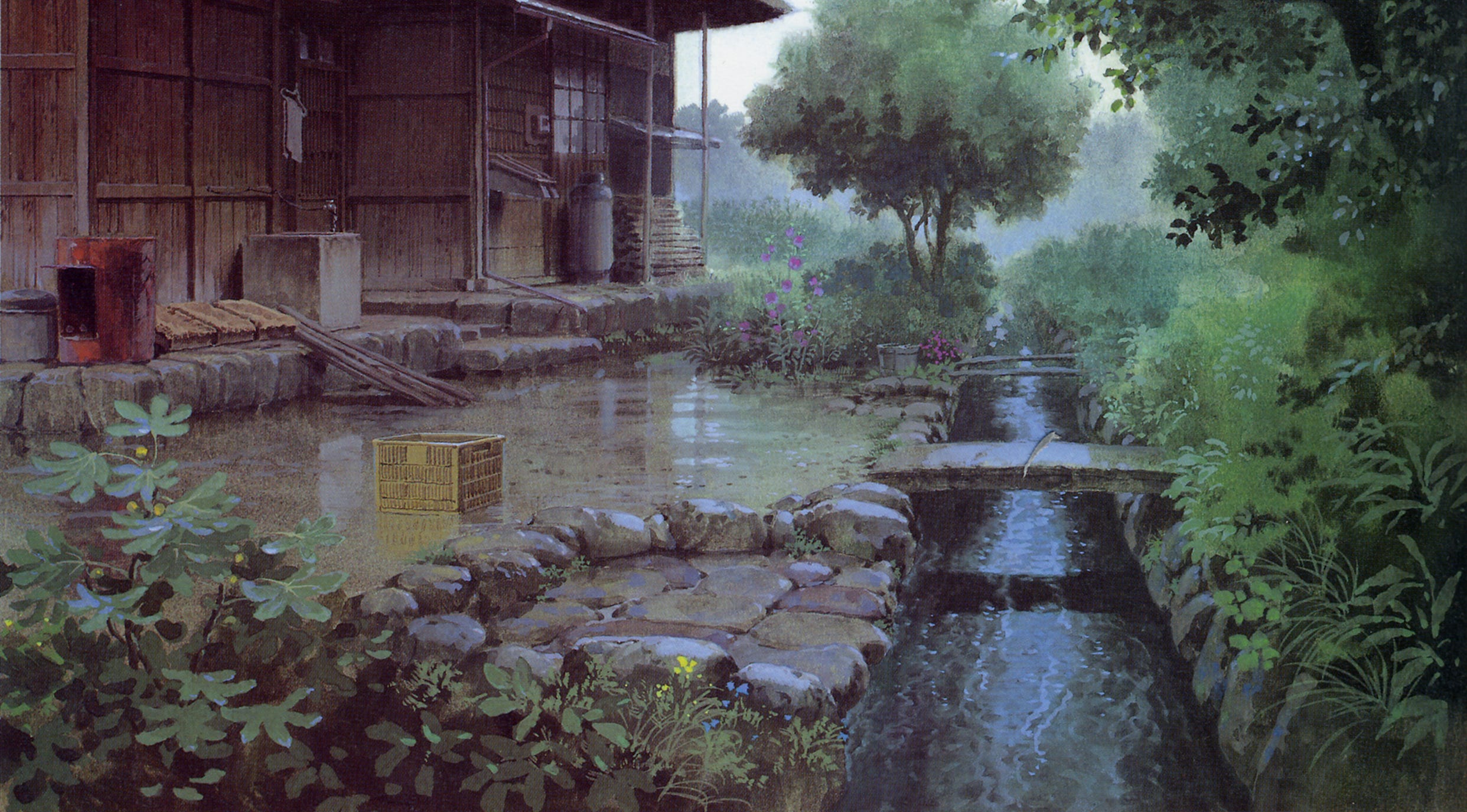
A Ghibli still doesn’t look like a Ghibli still because of the characters. It looks like Ghibli because of what’s BEHIND the characters. Once you notice this, you can’t un-notice it.
The man responsible for most of that “look” is Kazuo Oga — the art director who painted backgrounds for My Neighbor Totoro, Princess Mononoke, Only Yesterday, Pom Poko, Spirited Away, and many more.
Here’s what’s unusual about his process (sources: Animation Obsessive, Open Culture):
1️⃣ He paints wet-into-wet. Both sides of the paper get soaked with a Hake brush first. Then he drops bright poster paint into the wet surface — exactly like watercolor.
2️⃣ He works from BIG to small. Large washes first. Then medium shapes. Then, only at the end, those tiny dots — little “color spots” that suggest twigs, leaves, blossoms. The brain reads them as detail even though there’s almost nothing there.
3️⃣ He uses ~21 colors. Not 100. Oga said: “with a small number of colors, you can create a wide range of colors through subtle mixing.” He compared it to a Chinese restaurant cook who knows by instinct how much seasoning to add. Restraint is the technique. A bigger palette would actually break the Ghibli look.
4️⃣ A full background takes him about 6 hours.
Takeaway for you: if you want a Ghibli-feeling landscape, start with a wet underpainting on real paper (or a simulated one digitally), commit to large soft shapes first, and treat detail as confetti you sprinkle on at the end. Don’t render. Suggest.
2. “Ma”: the empty space that makes Ghibli feel like Ghibli


This is the single most underrated thing in the entire Ghibli aesthetic, and once you understand it, you’ll see it everywhere.
In a 2002 Roger Ebert interview, Miyazaki was asked about the “gratuitous motion” in his films: those moments where a character just sits, sighs, looks at a stream. Nothing is happening. The plot is on pause.
Miyazaki clapped his hands several times and said:
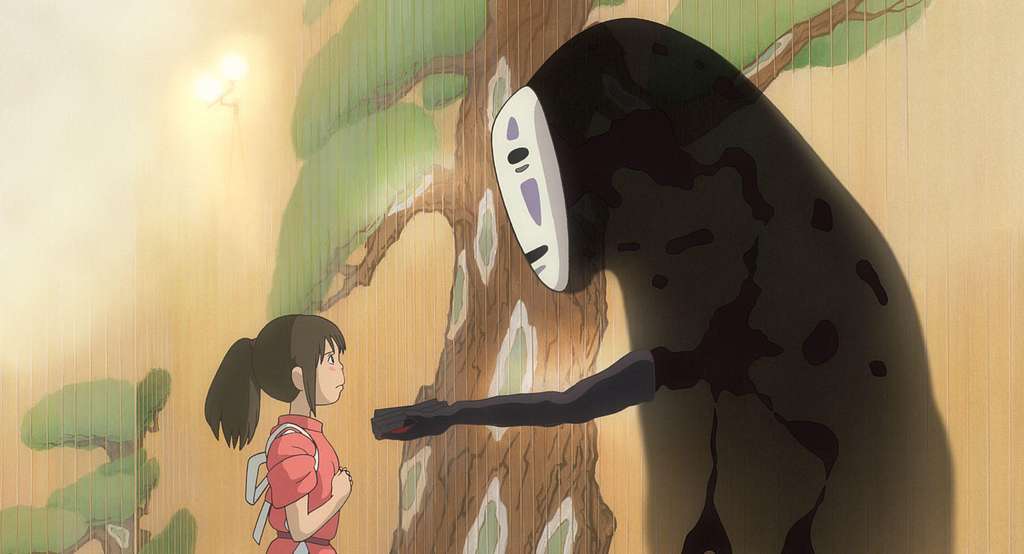
“Ma” (間) is a Japanese aesthetic concept that roughly translates to negative space, pause, or breathing room. It’s the gap between the notes that makes the music. In film, it’s the four-second shot of Chihiro sitting silently on the train in Spirited Away before she gets off at her grandmother’s stop. Nothing happens. Everything happens.
3. Nature isn’t decoration, it’s a character
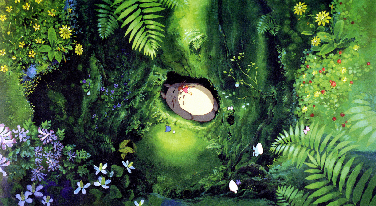
In Ghibli, the wind has feelings. The grass has opinions. The trees are watching.
This is not a metaphor — it’s an animation choice. Wind in Ghibli moves grass, hair, fabric, leaves, and dust at the same time, in different rhythms, in the same shot. Water has weight. Clouds have volume. A puddle gets its own beat in the edit. The camera holds on these things deliberately (see point 2 above).
Why does this work?
Because in Ghibli films, nature is what makes the magic feel real. If a forest spirit shows up in a forest you don’t believe in, you don’t believe in the spirit either. So the trees have to be more convincing than the spirit.
Practical takeaway for your own art:
- Give wind a job in the picture. Even on a still drawing, pick a wind direction and let it affect everything the wind touches: hair, fabric, leaves, smoke, water surface.
- Paint the air, not just the things in it. Atmospheric perspective, slight haze in the distance, light beams cutting through humid air.
- Detail your foliage like it matters. Even if the marks are loose, they should feel observed.
4. The food trick: Miyazaki is just a really good cook
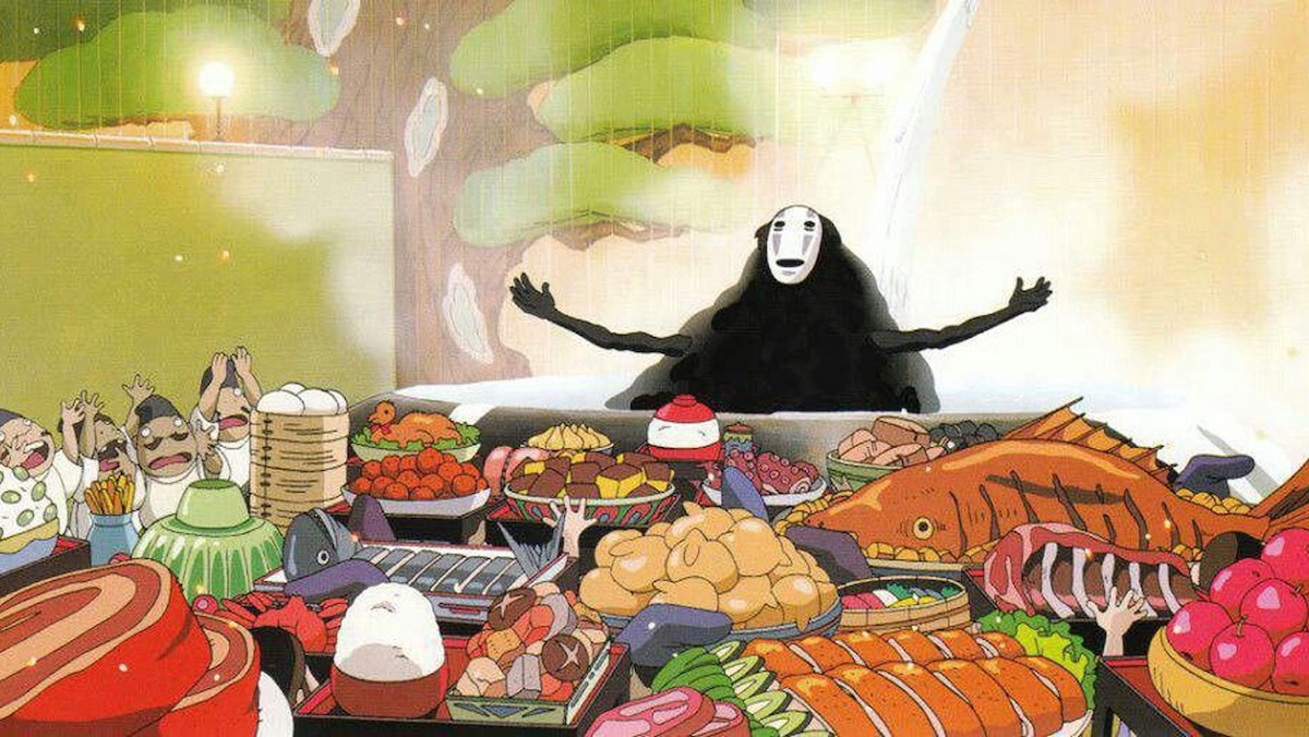
You’ve seen the memes. Ghibli food looks edible. Sometimes it looks more edible than actual food.
Here’s the secret, revealed by producer Toshio Suzuki: every Ghibli dish is based on something Miyazaki has personally cooked. The herring pie in Kiki, the ramen in Ponyo, the breakfast eggs in Howl’s, the onigiri in Spirited Away — all from Miyazaki’s actual kitchen (sources: Nerdist, Kotaku).
This connects to a bigger principle. In his 2009 essay collection Starting Point, Miyazaki wrote that an animator’s job is to “fabricate a lie that seems so real, viewers will think the world depicted might possibly exist.”
He’s saying: the only way to draw a believable lie is to start from something you actually know.
This is huge for your own work and it’s almost never said out loud:
- Don’t paint a generic forest. Paint a forest you’ve walked through. Use your own reference photos.
- Don’t paint a generic kitchen. Paint the kitchen you cooked breakfast in this morning.
- Don’t paint a generic “cozy room”. Paint the specific shelf with the specific mug.
Specificity is what makes the imaginary feel possible. That’s the whole trick. 🍳
5. European bones in a Japanese skin
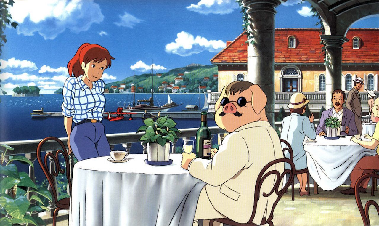
Miyazaki’s worlds are deeply, weirdly European. That mixed DNA is part of what makes them look unfamiliar in a comforting way.
The receipts:
- Kiki’s Delivery Service — the town of Koriko is heavily based on Visby in Gotland and parts of Stockholm. Miyazaki actually visited Sweden for it (Japan Times, 2024).
- Howl’s Moving Castle — the backgrounds are pulled from the Alsace region of France (those half-timbered buildings, the cobblestones, the steep gables).
- Porco Rosso — coastal Croatia and the Adriatic.
- Whisper of the Heart — Tama New Town near Tokyo, but the antique shop interior reads like a European children’s book.
All of this was documented in the 2006 NHK documentary The Scenery of Ghibli, which followed Miyazaki and Oga visiting these locations.
What’s the lesson? Don’t pick a place. Pick two places and let them have a baby. A Polish countryside meadow with a Japanese wooden farmhouse on it. A Mediterranean coastal town with a Tokyo vending machine. The “uncanny familiar” feeling that powers most Ghibli backgrounds comes from this hybrid worldbuilding.
It’s also why your “Ghibli-style” piece of your own neighborhood will feel more like Ghibli than a copy of an actual Ghibli shot. Because you’re doing what Miyazaki did — translating somewhere real through a foreign aesthetic.
6. Characters
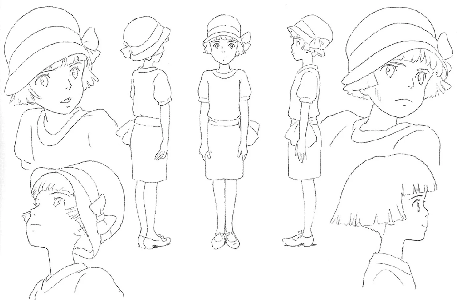
This one matters even if you mostly paint landscapes — because the figures inside Ghibli landscapes are part of the look.
Notice that Ghibli characters have:
- Simple, almost iconic faces — small noses, big eyes, very few lines. A Ghibli face is closer to a Tintin face than to a modern anime face.
- Realistic, weighted body movement — characters lean, stumble, push off when they run, sit heavily, sleep heavily. They have gravity.
- Specific, observed gestures — Sophie rolling dough, Kiki adjusting her bow, Chihiro pulling on her shoes. These are tiny things that almost no other studio bothers with.
- Children doing serious things — most protagonists are kids or young teenagers doing real labor: flying, working, surviving, cleaning bathhouses.
For your own work: if you’re painting a Ghibli-style scene with a person in it, simplify the face but observe the body. The face can be 4 lines. The way the figure stands has to be specific.
7. Visual motifs

A Ghibli mood is held together by recurring motifs that show up across totally different films. You can lift these one at a time:
- Morning light over a slow scene. Steam from a cup. Hair blowing slightly. Someone watching.
- Flight. Brooms, planes, dragons, gliders, falling, jumping. Verticality.
- Trains. Long, sad, going somewhere quiet.
- Cats. Often watching from the corner, sometimes talking, sometimes commenting on humans being foolish.
- Food preparation. Not eating, making. Chopping, kneading, stirring.
- Rain. Heavy, warm, sometimes welcomed.
- Wind through wheat or tall grass. Possibly the signature Ghibli shot.
- Laundry on a line. Quiet domesticity as a love language.
- Open windows. The line between inside and outside is always permeable.
Did You Like it?
I’d love to make this article and the color one part of a bigger ebook with a super-comprehensive analysis of Studio Ghibli style: palette, backgrounds, “ma”, composition, light, the whole thing in one place.
So, if you’d like to show me your support and think such an ebook is a nice idea:
- DM me: Instagram, TikTok, Cara
- Email me: mlecznymleczart@gmail.com
- Or sign up for the newsletter!
Ghibli Ebook [WAITLIST]
Signup for Ghibli ebook updates & get a message once it’s OUT!
Self-taught digital painter who likes to write about art & drawing. Mostly painting urban scenes during golden & blue hour.